
Nikki Rees
Identity
Years spent creating interiors for brands such as Gap, Oasis, Ann Klein, Knight Frank and Marks & Spencer, helped Nikki gain the experience to set up her own company providing interior solutions for both retail and domestic markets.
She needed an identity that could project confidence in the retail sector, but a softer and subtler approach in the domestic market.
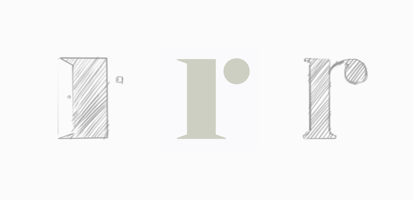 A bold icon was created from the 'r' of Rees, made of a door device and a light switch. The muted, warm grey suggested her priority was on her clients, rather than her own personality.
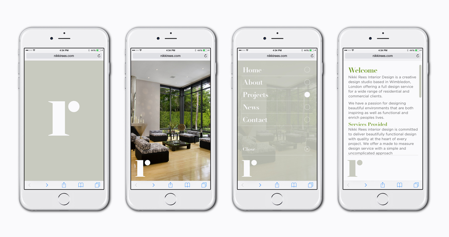
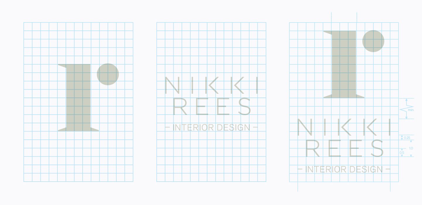 The icon was designed to be used on its own, or accompanied with its unique logotype.
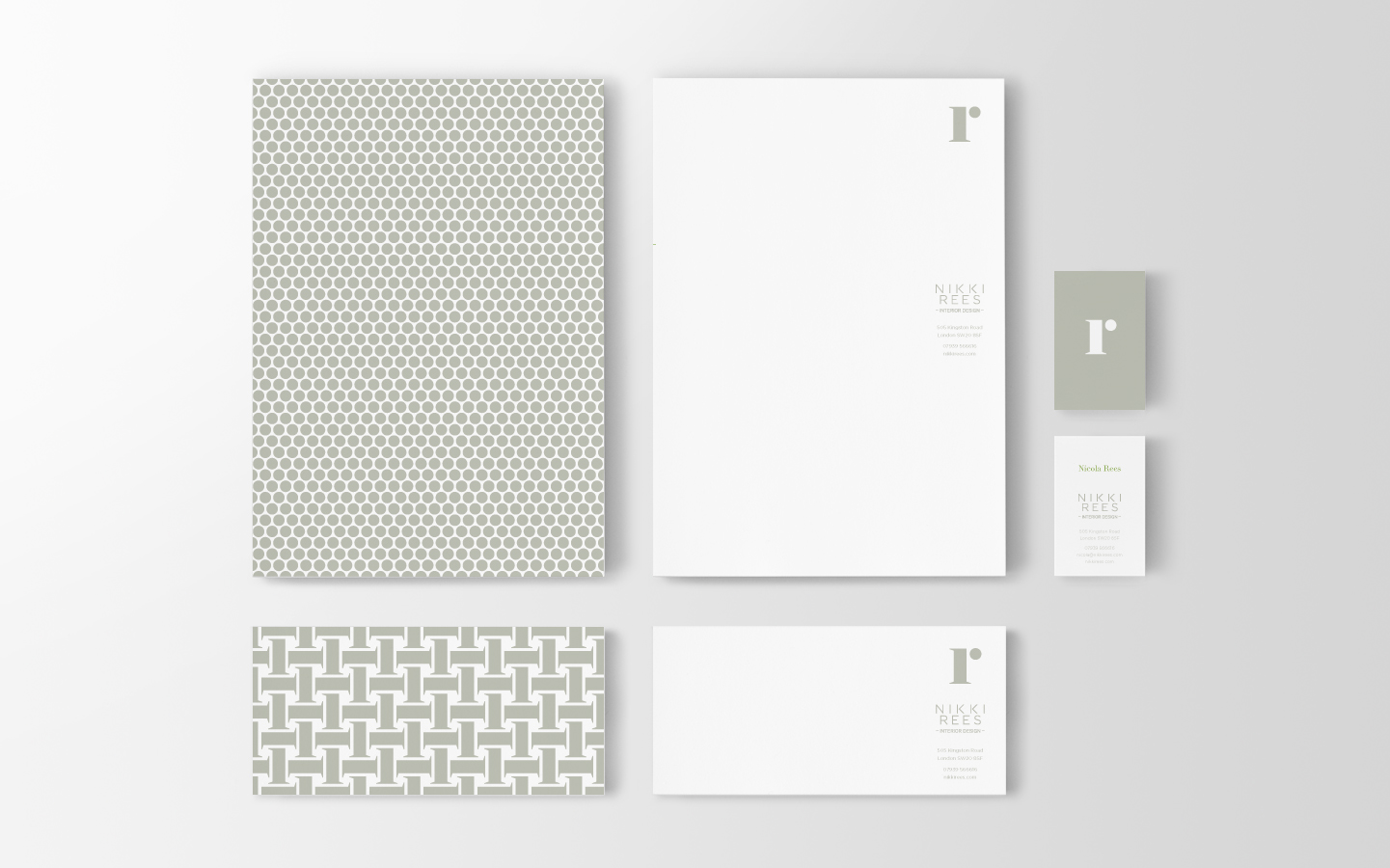 The stationery echoes her understanding of how materials, colour and textile can help promote a client's personality.
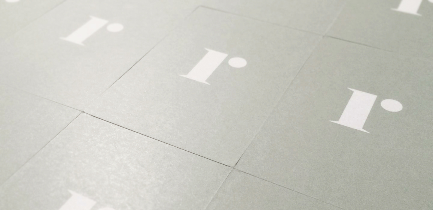
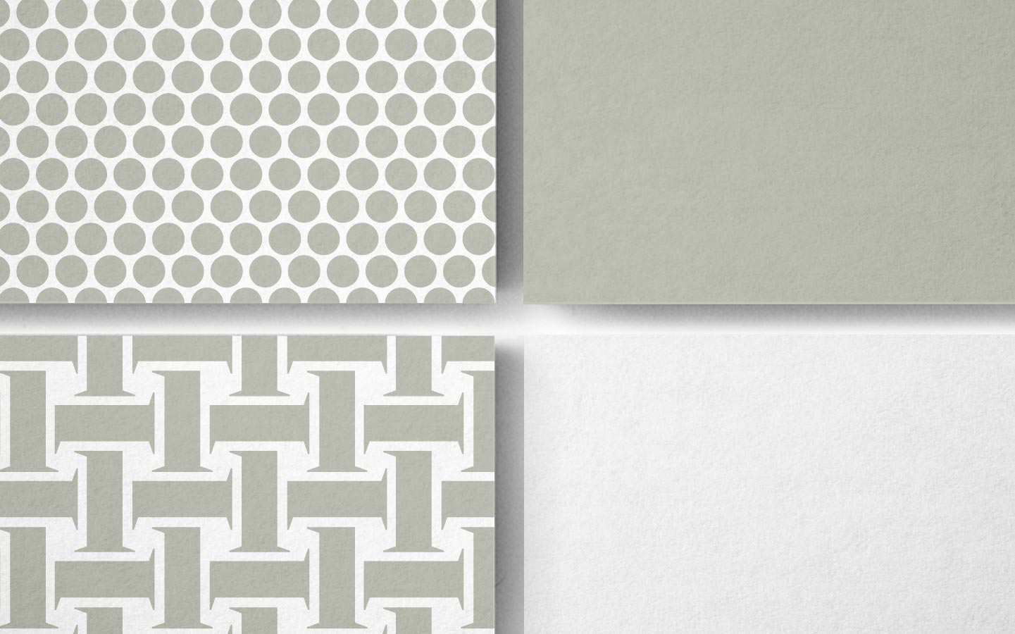 Deconstructing the icon helped create graphic patterns to represent different materials.


© Neil Thomas